Sacred by Design: Haggadah as the Designer’s Midrash
(Ben Shahn’s Haggadah, 1966.)
There are few printed texts more frequently reproduced, redacted, annotated, or aesthetically reimagined than the Pesach Haggadah. Bound to no fixed typography and freed from the obligations of authorial attribution, the Haggadah exists in a liminal space between prayerbook and zine, manuscript and manual.
To design a Haggadah is to enter into dialogue with a tradition that is already polyphonic. The structure is fixed, yet endlessly interpreted; the text is sacred, but fundamentally interactive. It invites re-telling not only through voice, but through form.
If classical midrash is the rabbinic act of filling in the silences of Torah, then Haggadah design might be understood as its visual counterpart: a form of commentary conducted in paper stock, layout, type, and image.
I grew up with my dad’s collection of manuscript Haggadot reprinted annually by The Diskin Orphan Home of Israel—modest facsimiles of antique editions, printed cheaply as a fundraising effort, but with a kind of solemn grandeur. They smelled like old photocopiers and, according to my father, arrived in the mail with slips of paper asking for tzedakah. Over the years, they accumulated into a strange archive of Jewish graphic memory: each edition drawn from a different European manuscript tradition, each revealing how Jews across centuries visualized freedom. A bold lion beside the Ten Plagues. Italianate arches framing the Four Questions. These weren't "designer" Haggadot in the modern sense, but they were deeply designed—structured to carry visual memory across time.
Some of the Haggadot re-printed by The Diskin Orphan Home
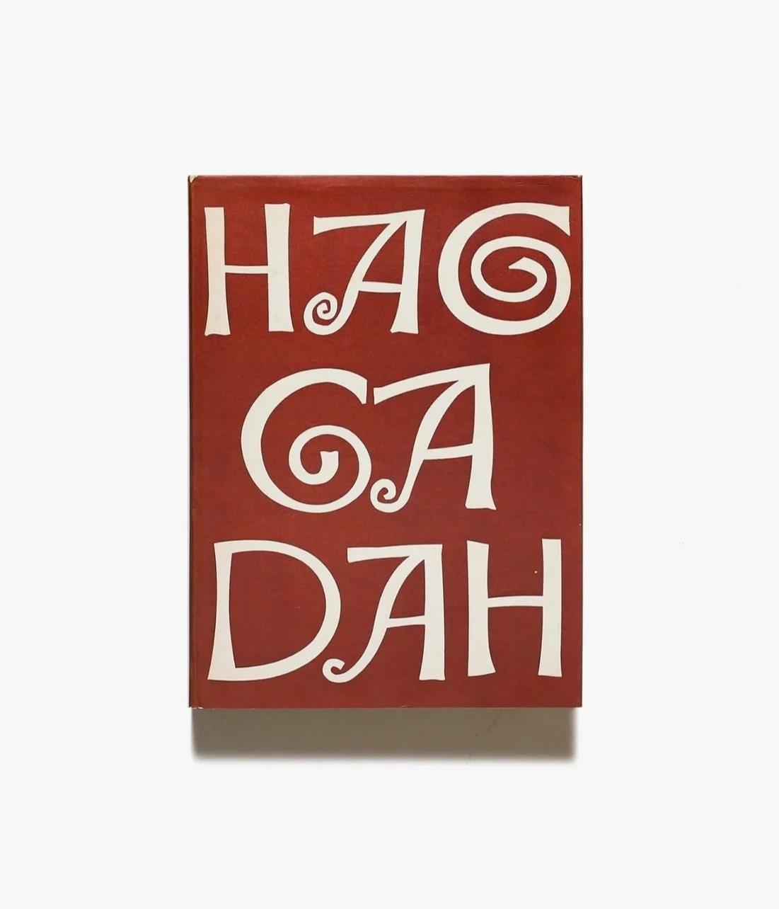
Ben Shahn’s 1965 Haggadah offers one such intervention. Shahn, a Lithuanian-born American painter and social realist, used his signature line work and calligraphic lettering to translate the Seder’s drama into something personal and political. His typography moves between Hebrew and English with intentional asymmetry. It’s not meant to harmonize, but to reveal tension. These design decisions aren’t ornamental—they’re ideological. Shahn brings the protest tradition into liturgical space, using the Haggadah as a lens for Jewish diaspora identity, displacement, and solidarity.

Chad Gadya, Ben Shahn’s Haggadah, 1966. Images via MoMA.
One of the most direct echoes of that spirit came just four years later. In 1969, Rabbi Arthur Waskow published The Freedom Seder, a radical reimagining of the Passover ritual in the wake of Martin Luther King Jr.’s assassination. Drawing visual and rhetorical inspiration from Black liberation art and the counterculture press, the Haggadah merged the Exodus narrative with the Civil Rights movement. The design, by Black Jazz musician and artist Lloyd Mcneill, was rough and immediate—typewritten pages, hand-lettered headings, layout that leaned more toward political zine than siddur. And that was the point. It was a Haggadah built for protest, a format that privileged urgency over elegance. Design here didn’t just reflect liberation; it enacted it.

The Freedom Seder, illustrated by Lloyd Mcneill, 1969.

If Shahn and Waskow brought political urgency to the text, Saul Raskin brought theatrical weight. His 1941 Haggadah is lush with etching and iconography—figures carved in stark contrast, faces contorted in anguish or awe. Trained in the Beaux-Arts tradition and steeped in Yiddish cultural life, Raskin approached the page like a stage. His layouts are dense, overfilled, but always in service of emotional presence.
It’s not just illustration—it’s insistence. The story must be seen as much as it is told.This tension—between preservation and reinvention, reverence and refusal—is where the most compelling Haggadah design tends to dwell.
Dan Reisinger’s Feast of Freedom, published in 1981, strips away human figures entirely. Instead, his modernist papercuts reduce the narrative to geometry: a square for slavery, a curve for the Sea of Reeds. Reisinger, the Israeli designer known for his airline posters and national logos, brought to the Haggadah the logic of branding—but without the gloss. His pages breathe. They trust the reader to do the work. Here, visual restraint becomes a spiritual prompt.
Dan Reisinger’s Feast of Freedom, 1981.
Then there is Yaacov Agam, who doesn’t restrain at all. His kinetic Haggadah from 1974 transforms the reading experience into a ritual of motion. Printed with lenticular illusions and layered imagery, it invites the reader to tilt and interact, revealing new symbols at every angle. Agam's design is not just midrash—it is a visual reenactment of the Exodus, where revelation is made contingent on movement. Freedom is something glimpsed only as the page shifts.

Yaacov Agam’s kinetic Haggadah, 1974.
But not every Haggadah needs to be avant-garde to make a statement:

In fact, the most widely used Haggadah in Jewish history—the Maxwell House edition—says more about the democratization of ritual than many limited-edition artist books. First produced in 1932 by an ad agency seeking to market coffee to Jewish consumers, the Maxwell House Haggadah paired a traditional Ashkenazi text with functional, no-nonsense layout. It became ubiquitous not because it was beautiful, but because it was free. And it proved that accessibility itself is a kind of design value.
More recently, a new wave of Haggadot has emerged, shaped by the tools and visual instincts of contemporary design culture. Haggadah Revisited, a three-volume project from Judaica Standard Time, reflects this shift with precision. Designed by James Anderson, each edition moves fluidly between reverence and experimentation—employing risograph printing, minimalist iconography, and carefully structured page systems that feel more like small-run artist books than traditional religious texts.


Haggadah Revisited, designed by James Anderson for Judaica Standard Time.
Rather than relying on the usual symbols—pyramids, Stars of David—the designs draw from deeper visual references: typographic nuance, artifact-like emblems, and structural clarity. It’s not a reinvention for the sake of trend, but a studied attempt to translate ritual into the visual language of a generation raised on both museum labels and PDF layouts. In that sense, the design doesn't modernize the Haggadah—it enters into its conversation.

Judaica Standard Time
That question is never fully answered. Which is, perhaps, the point. The Haggadah is not a finished book. It is a process—a ritual object meant to be held, spoken through, spilled on, and revised. The designer enters this tradition not as an illustrator but as a commentator, a participant in the long, often messy conversation about what it means to be free.
Design, at its best, doesn’t solve that question. It keeps it alive.